Office bar vs the Longhorn Sidebar
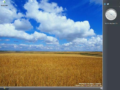
Ok, look at that above image. I know screen sizes are getting bigger and resolutions are getting higher, but why o’why would I want a big old bar taking up all that screen real estate? It makes no sense to me.
I remember when Microsoft tried to do a similar screen eating sidebar when they released Office, very few used it and finally it has faded away. So why bring it back? Because you can add cool widgets to it? I’d rather use Konfabulator for that, since you can put the widgets anywhere on the desktop.
Does anyone like the sidebar? please chime in on this one, or do we all agree that this is a big waste of space?!
2 comments
Archived from the original post. Comments are closed.
Vivek
Waste of space. Although I have bigger complaints about Apple (since that's what I use). The new iCal, with the "Info" drawer, is so large that it won't fit on my 12.1" iBook screen. I actually have to slide the window to see the info drawer. And though I could shrink the width of the calendar itself, it's already so small that I barely get one word in for each event.
Ray Slakinski
iCal is fixed, Longhord remains the same.